“Good design is good business.”
T. J. Watson Jr
IBM
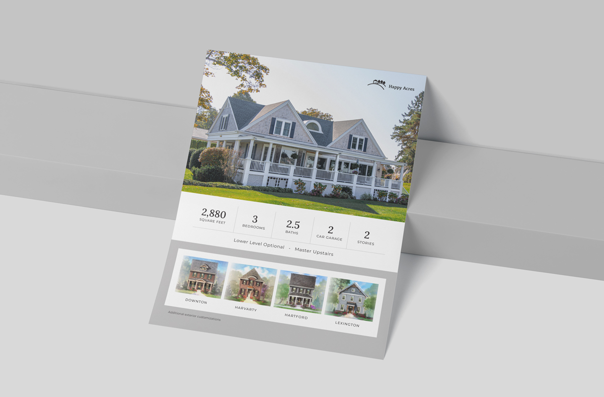
Today, I’ll be finishing floor plan and inventory feature flyers for a home builder. Why have they decided to redesign their flyers? Well, it usually goes beyond just wanting to be more visually appealing. If data is displayed haphazardly, it can create problems for both the sales team and the consumer. The sales team will struggle to understand their own products. With an extensive library of plans and elevations, you want to make their lives as easy as possible by simplifying the system. For the consumer, they want the data that’s important to them to appear first (by way of type hierarchy). You want to make their job, which is to purchase, as painless as possible. With a long road of home building ahead of them, this should be one of the easy parts.
Problem:
Misrepresentation of price point
Design-led Solution:
While maintaining cohesion, we will also design to elevate the visual identity of the brand. We can achieve this by careful consideration of typefaces, color, layout, and textures.
If you’re selling a million-dollar home, your collateral should look the part.
Problem:
Confusion
Design-led Solution:
By emphasizing square footage, # of rooms, # of bathrooms (the nitty-gritty), your customer can make quick determinations without the visual design being an obstacle.
In this particular case, they had one page for the plan details and a single page for each elevation type. With 10 plans with an average of 4 elevations each, that’s over 40 pages you need to keep organized. We can keep it simple. Utilizing a 2-sided page will create a concise plan library and cut down on printing costs.
If your sales team is confused, your customer definitely is. It’s our responsibility to make the sales process as easy as possible. Your team can’t effectively sell your product if they have to battle confusion. Remove as many obstacles as possible and make your information easily digestible.
Problem:
Lack of asset control
Design-led Solution:
Establish editable templates and create an easy system to replicate and maintain.
Your organization should have control over your own assets. For the budget-conscious, by having the ability to easily edit on your own (e.g., a price change), you will have more ownership and avoid additional upcharges. Templates can be designed to fit your unique situation.
For this builder, we will be implementing InDesign and providing packaged files for them to own. I’ll be creating a layout system that is flexible, modular, cohesive, and easy for anyone to make quick changes.
Problem:
Lack of cohesion
Design-led Solution:
Create a layout system that is easily translated from plan to plan and community to community. Above all, keep to your established brand standards and guidelines.
From a 10,000 foot view, all of your touchpoints should be intentional, cohesive, and recognizable. This builds brand equity and trust with your buyers.

